Wednesday, February 29, 2012

Coloring Samples, Part 4

(Continued from Part 3)

More fun!

TALES TO ASTONISH 76, page 7  /
art by Jack Kirby, Gil Kane & Mike Esposito   (February 1966)

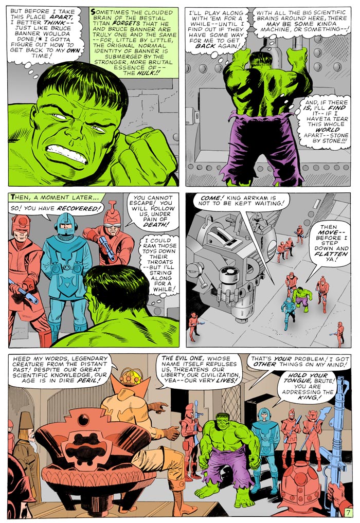
Once again, I avoided looking at the original color, intent on seeing what I could come up with entirely on my own.  I wanted the war-torn future to have a "barbarian" look about it, drab, low-key, with The HULK being the one bright patch of COLOR in the whole place!  I doubt Stan Goldberg would have used so many browns and grays on an interior page, as he knew how difficult it was getting them consistent from the printer they were using at the time.

X-MEN 53  /  rejected cover by BARRY SMITH   (February 1969)
 Chris Haizlip sent me a scan of the above.
"Hey, is there any chance you'd like to color this?  I found this unfinished cover for X-Men 53 on a couple of sites, and on the original art Barry Windsor-Smith sketched out the logo:  The X-Men, featuring The Rage of Blaastar!  He probably didn't yet know that they stopped using those kinds of logos a few issues earlier, but I always liked the logo.  So I mocked up a quick cover in Photoshop, using the text from page 1.  I thought it would look great on our blogs if it were colored in the style of the published issue.  Let me know what you think, and if you're interested in taking a crack at it!Thanks!"

My response:

Well,  that didn't take too long.
I spent an hour or two last week playing around with the design.  I really wanted it to be the proper proportions.  This meant losing some of the background detail, but A)it couldn't be helped, and B)it was a question of what was really important.
I looked at several other covers from the period, and realized Cyclops was only colored purple on this one, and, apparently, to somehow distinguish him from the Beast, who was blue.  But he was blue on every other cover.  And, having both hero and villain in shades of purple didn't seem right.  Plus, blue makes a better contrast with reddish-orange. 
I decided to more-or-less go with the original background color.
I think the shading on Blastarr makes more sense here than it did on the original.  I thought about adding a shade to Cylcops, but then decided he looked okay as-is.  My tendency is to go with as simple as possible, then add if it feels necessary.  Too many modern colorists totally sacrifice the power of graphic simplicity because they mistakenly think "more" is better. (Or, they just don't know what the HELL they're doing.)
Similarly, I was about to color in the figures in the corner box... when I realized, no, it looks fine as a single color!  It works as an effect, it goes well with the background color, and also subtly separates the rest of the group from the main cover image, since they're not there.

OMAC 9  /  art by David Morris & Dek Baker   (2002)
X-MEN 33  /  rejected cover by Werner Roth & John Tartaglione   (June 1967)
X-MEN seems to have had more than its share of rejected covers.

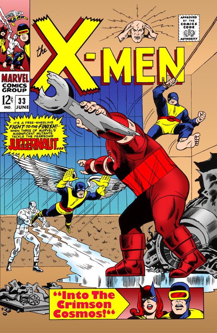
X-MEN #33 had 2 different covers rejected.  The first was by then-series regular Werner Roth.  While I consider Roth's depiction of the characters to be the definitive one (above even Kirby, who created them, and Adams, whose work was a huge inspiration for the 70's revival), he was known more for romance than action. 

Gil Kane, a longtime DC mainstay, wound up doing several Marvel covers around this time.  AVENGERS #37 (Feb'67) & X-MEN #33 (Jun'67), both books written by Roy Thomas, had Kane's work replacing already-drawn pieces by each book's regular artist (Don Heck & Werner Roth, respectively).  

X-MEN 33  /  rejected cover by GIL KANE   (June 1967)
Kane's X-MEN cover ran into problems.  First, several changes were made, including the positions of both hands on both Marvel Girl and Cyclops, Cyclops' eye-beams were added, and a lot of minor rendering lines were added or redrawn on the main figure's hands. 

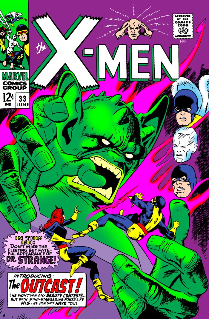
But then, the Comics Code apparently thought the main figure of "The Outcast" was too frightening.  So The Outcast was replaced by The Juggernaut (who had been on Roth's cover in the first place).  Juggernaut's hands were left unchanged from the previous version.  The figures of Marvel Girl & Cyclops were replaced with Iceman and Angel, and their floating heads were replaced with the faces of Cyclops and Marvel Girl-- taken directly from Roth's cover! 

Thomas & Kane would go on to collaborate on a wide variety of books, including the creation IRON FIST

With the Werner Roth cover, I colored the figures first, then, by trial-and-error, designed the background colors for contrast and dynamic effect.  I like how the color scheme wound up looking so "pleasant" and "traditional", which was a perfect fit for Roth's art.  

For Gil Kane's cover, I started out the same way, but for contrast, my choice of colors, first on "The Outcast" and then on the background, was designed to highlight their otherworldliness and evil, as well as reflect the manic intensity of Kane's art. I didn't even bother trying to make it similar to the published version, and I specifically wanted it to be as "wild" and "demented" as possible.  I feel this manages to capture the look of the era (1967 was the "summer of love" and "psychedelia" after all) but also comes close to almost looking like a "black light" poster.

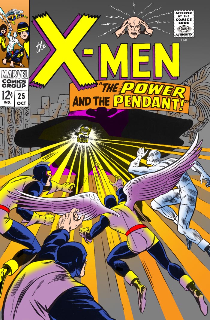
X-MEN 25  /  rejected cover by Werner Roth & Dick Ayers   (October 1966)
Legend has it editor Stan Lee didn't like covers with heroes facing away from the readers.   More recently I've read that he really didn't like heroes whose behinds were facing him... but never mind that.  For this one, I decided to go with the gray background of the published cover, but for the glowing light, I wanted something other than just white & yellow, so I went with yellow & orange instead. While I do think Jack Kirby's published cover was more exciting than this one, it seems a shame for a book's regular artist to get shoved aside for something so trivial.  The trend, unfortunately, continued, as over the next couple years Werner Roth would be REPEATEDLY replaced by other artists on the book's interiors, including Jack Sparling, Dan Adkins, Ross Andru, Don Heck, George Tuska, Jim Steranko, Barry Smith, and, untimately, Neal Adams.

It's a hell of a thing when an artist is reduced to being a guest-star on his own book.

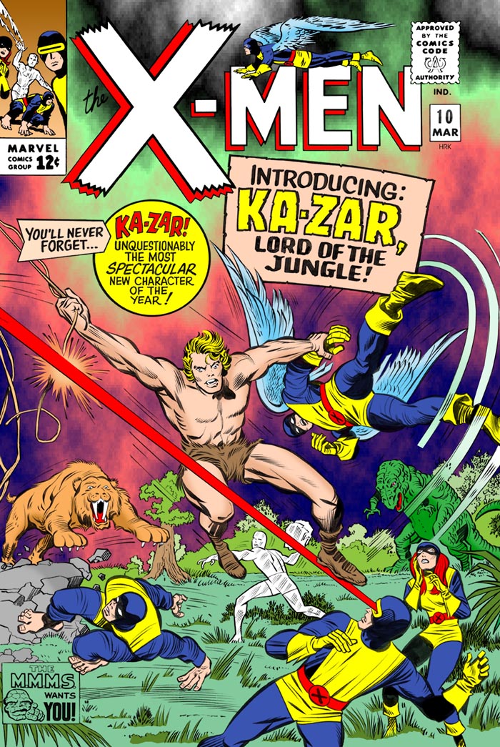
X-MEN 10  /  rejected cover by Jack Kirby & Chic Stone   (March 1965)
Tarzan knock-off were a dime a dozen in the 30's & 40's, even as Superman knock-offs were.  Timely / Marvel had their own-- KA-ZAR-- first as a a pulp magazine character, then translated into the comics.  25 years later, a brand-new, totally-unrelated version cropped up in the new "Marvel Universe".  Did Martin Goodman request it, to revive and/or protect the name? It seems possible. One thing's for certain, the new character sure seemed more brain-damaged than Johnny Weismuller ever was in his TARZAN movies.

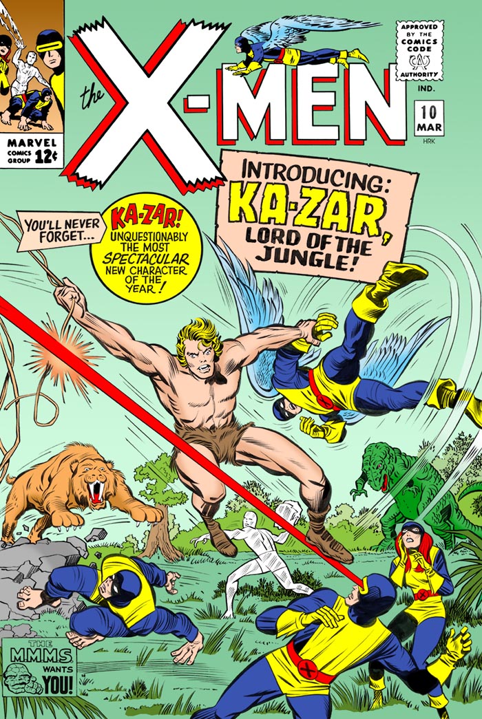
Not sure why this cover was rejected, although perhaps it was a lack of focus.  The published version had a much bigger close-up of Ka-Zar, lunging at The Beast while Cyclops once again fired those annoying eye-beams at him.

I really didn't like the gray plants & white sky in the original, so I let my own instincts dictate the color scheme.

This cover, I'm pretty sure, had already turned up on an issue of Chrissie Harper's JACK KIRBY QUARTERLY magazine some years ago.  I didn't dig that out for reference, either.

X-MEN 10  /  rejected cover / 
"Ralph Bakshi-Gray Morrow" tribute version   (March 1965)

More as I go!

Artwork (C) Marvel Comics /
Raw scan of TALES TO ASTONISH #76, page 7 from Heritage Auctions site
Raw scan of X-MEN #53 supplied by Chris Heizlip
Raw scans of X-MEN #25 & 33 (Werner Roth)
     from THE JACK KIRBY COLLECTOR
Raw scan of X-MEN #33 (Gil Kane) supplied by Roy Thomas
Raw scan of X-MEN #10 from Original Comic Art Locator site

New Color by Henry Kujawa.

     See all my COLORING work:
Rebel 3, Part 1 art by Jeff Toliver
Rebel 3, Part 2 art by Jeff Toliver
American Sentinels pin-ups by various artists
HSQ covers by Jeff Toliver
American Sentinels, Part 2 by Eric Douthitt
American Sentinels, Part 3 by Eric Douthitt
Coloring Samples by various artists
Coloring Samples, Part 2 by various artists
Coloring Samples, Part 3 by various artists (HSQ comics)
Coloring Samples, Part 4 by various artists

     Edgar Allan Poe stories in COLOR:
CAVALEIRO ANDANTE 453 (Sep'60) --
     "THE GOLD BUG" by Fernando Bento
CLASSICOS DE TERROR 1 (1960) --
     "THE CASK OF AMONTILLADO" by Gedeone Malagola
CLASSICOS DE TERROR 8 (1960) --
     "LADY BERENICE" by Flavio Colin
CLASSICOS DE TERROR 9 (1960) --
     "THE MASQUE OF THE RED DEATH" by Manoel Ferreira
     "THE PIT AND THE PENDULUM" by Gedeone Malagola
CLASSICOS DE TERROR 12 (1961) --
     "I'M ALIVE!" by Gedeone Malagola
CLASSICOS DE TERROR 14 (1961) --
     "THE BLACK CAT" by Luiz Saidenberg
EERIE 12 (Nov'67) --
     "THE MASQUE OF THE RED DEATH" by Tom Sutton
ALBUM CLASSICOS DE TERROR ? (1967) --
     "NEVERMORE!" by Luis Meri
ALBUM CLASSICOS DE TERROR 3 (1967) --
     "THE MASQUE OF THE RED DEATH" by Nico Rosso
     "MANUSCRIPT FOUND IN A BOTTLE" by Osvaldo Talo
ALBUM CLASSICOS DE TERROR 4 (1967) --
     "THE OVAL PORTRAIT" by Osvaldo Talo
     "THE CASK OF AMONTILLADO" by Osvaldo Talo
ALBUM CLASSICOS DE TERROR 5 (1967) --
     "THE FALL OF THE HOUSE OF USHER" by Osvaldo Talo
ALBUM CLASSICOS DE TERROR 6 (1968) --
     "WILLIAM WILSON" by Osvaldo Talo
     "BERENICE" by Edegar & Ignacio Justo
ALBUM CLASSICOS DE TERROR 7 (1968) --
     "THE FACTS IN THE CASE OF M. VALDEMAR" by Edegar & Ignacio Justo
     "THE TELL-TALE HEART" by Nico Rosso
     "A DESCENT INTO THE MAELSTROM" by Edegar & Ignacio Justo

More coming!!

Saturday, February 25, 2012

ASTONISH, Part 6

(Continued from Part 5) 

TALES TO ASTONISH 81  /  art by Jack Kirby & Bill Everett   (July 1966)
TALES TO ASTONISH 82  /  art by Gene Colan & Dick Ayers   (August 1966)
TALES TO ASTONISH 83  /  art by Jack Kirby & Bill Everett   (September 1966)
MARVEL SUPER-HEROES 38  /
art by Jack Kirby & Bill Everett   (September 1973)
TALES TO ASTONISH 84  /  art by Gene Colan & Dick Ayers   (October 1966)
MARVEL SUPER-HEROES 39  /
art by Gene Colan & Dick Ayers   (October 1973)
TALES TO ASTONISH 85  /  art by BILL EVERETT   (November 1966)
MARVEL SUPER-HEROES 40  /  art by BILL EVERETT   (November 1973)
More when they get done!

Art (C) Marvel Comics

Raw scans of #81-82 and MSH #38-40 from my collection
Raw scan of #83-85 from Barry Pearl

Restorations by Henry Kujawa

Thursday, February 16, 2012

The DEFENDERS

In the wild years of expansion, Roy Thomas got the idea to team up several characters who did not seem to be good fits for a team book.  The list included Sub-Mariner, The Hulk, and Silver Surfer.  However, when Stan Lee requested that nobody use The Surfer on a regular basis (saying he wanted to write the character himself), Roy decided on Dr. Strange instead.  The final issue of Doc's late-60's mag had led into a loose 3-parter that spanned his book, Subby's and The Hulk's, so the precedent was already there.

Following 3 appearances in MARVEL FEATURE, THE DEFENDERS got their own series, and soon had a mammoth crossover with THE AVENGERS, making the "official" super-team of the Marvel Universe aware of "the other guys".

When the idea of quarterly GIANT-SIZE books came around, naturally THE DEFENDERS was one of them, and for 5 issues, and a wild assortment of creative personnel, GIANT-SIZE DEFENDERS was one of the most interesting "must-read" books of the mid-70's.

GIANT-SIZE DEFENDERS 1  /
art by Gil Kane, Frank Giacoia & Mike Esposito (w/ John Romita)   (July 1975)
Just as with GIANT-SIZE SUPER-VILLAIN TEAM-UP, when the 1st issue of this book was put on the schedule, there was not enough time to actually do a full book. Tony Isabella, Jim Starlin & Al Milgrom stepped in and concocted a 9-page character piece. Following up on The Hulk FINALLY being convinced that "stupid magician" and "sword girl" were (GASP!) his "friends" (see the last page of THE DEFENDERS #12), he follows Doc home for a peaceful meal. As he does, Valkyrie asks Doc's girlfriend Clea about the "team", which serves as the perfect excuse for flashbacks, in the form of reprints! What could have been mere filler of the most tedious kind, instead, thanks to those involved, became 9 of the most INTENSELY stunning pages in Jim Starlin's career. I became convinced after seeing these pages, that Starlin really should have done a run of DR. STRANGE. I also feel that he gave us just about the SEXIEST depictions ever seen of both Clea, and The Valkyrie!

Interiors by Jim Starlin & Al Milgrom
GIANT-SIZE DEFENDERS 2  /
art by Gil Kane & Klaus Janson (w/ John Romita)   (October 1975)
GIANT-SIZE DEFENDERS 3  /  art by Ron Wilson & Joe Sinnott   (January 1976)
Interior by Jim Starlin & Dan Adkins  /  hand-colored by Jim Starlin
(page courtesy of Heritage Auctions)
GIANT-SIZE DEFENDERS 4  /  art by Gil Kane & Frank Giacoia   (April 1976)
GIANT-SIZE DEFENDERS 5  /  art by Ron Wilson & Al Milgrom   (July 1976)

Art (C) Marvel Comics
Scans from my collection
Restorations by Henry Kujawa

Sunday, February 5, 2012

Steve Ditko, Part 2

(Continued from Part 1)

interior from STRANGE TALES 137  /  art by STEVE DITKO   (September 1965)
interior from STRANGE TALES 138  /  art by STEVE DITKO   (October 1965)
interior from AMAZING SPIDER-MAN ANNUAL 2  /
art by STEVE DITKO   (October 1965)

There's a scene similar to this in the 3rd-season SPIDER-MAN cartoon, "Revolt In The Fifth Dimension" (1969), itself a redo of a 3rd-season ROCKET ROBIN HOOD cartoon from the previous year. I wonder if this page in any way inspired the Ralph Bakshi-Gray Morrow cartoons?

AMAZING SPIDER-MAN poster / art by STEVE DITKO  (196 ?)
SHOWCASE 73  /  art by STEVE DITKO   (April 1968)
SHADE, THE CHANGING MAN 3  /  art by STEVE DITKO   (November 1977)
Robin Snyder's REVOLVER (#1)  /  art by STEVE DITKO   (November 1985)
DITKO PACKAGE (#1)  /  art by STEVE DITKO   (1989)
Steve Ditko's STRANGE AVENGING TALES 1  /
art by STEVE DITKO   (February 1997)

Art (C) Marvel Comics, DC Comics, Robin Snyder, Fantagraphics.

Restorations by Henry Kujawa.

For more:
Read about Steve Ditko at Wikipedia.
Read about Steve Ditko at the Steve Ditko site.
See more of Steve Ditko's work at the Steve Ditko Comics Weblog site.
See my Steve Ditko tribute!
See Steve Ditko Books IN PRINT at Steve Ditko Comics Weblog.
Visit the Steve Ditko Fans FB group!
Visit the Steve Ditko Apprciation Group on FB!

Read the Steve Ditko HOUSE OF USHER adaptation!
Read the Steve Ditko MASQUE OF THE RED DEATH adaptation!
Read the Steve Ditko RAVEN story!

Steve Ditko

I've done relatively little restorations of Steve Ditko's covers, but I figured it would be nice to put together a page dedicated to him, anyway.

THE INCREDIBLE HULK 2  /  art by Jack Kirby & Steve Ditko   (July 1962)
AMAZING FANTASY 15  /  art by Jack Kirby & Steve Ditko  (August 1962)
THE INCREDIBLE HULK 6  /  art by STEVE DITKO   (March 1963)
AMAZING SPIDER-MAN 1  /  art by Jack Kirby & Steve Ditko   (March 1963)
AMAZING SPIDER-MAN 2  /  art by STEVE DITKO   (May 1963)
interiors from STRANGE TALES 126  /  art by STEVE DITKO   (November 1964)
fantasy cover for STRANGE TALES 132  /  art by STEVE DITKO  /
design by Henry Kujawa   (May 1965)

interior from STRANGE TALES 132  /  art by STEVE DITKO   (May 1965)
(Continued in Part 2)

Art (C) Marvel Comics.

Scans from my collection.
Raw scans of HULK #2 & 6, AMAZING FANTASY #15
     and AMAZING SPIDER-MAN #1 from Barry Pearl
Raw scan of AMAZING SPIDER-MAN #2 from Heritage Auctions

Restorations by Henry Kujawa

For more:
Read about Steve Ditko at Wikipedia.
Read about Steve Ditko at the Steve Ditko site.
See more of Steve Ditko's work at the Ditko Cultist blog.
See more of Steve Ditko's work at the Steve Ditko Comics Weblog site.
See my Steve Ditko tribute!
See Steve Ditko Books IN PRINT at Steve Ditko Comics Weblog.
Visit the Steve Ditko Fans FB group!
Visit the Steve Ditko Apprciation Group on FB!

Read the Steve Ditko HOUSE OF USHER adaptation!
Read the Steve Ditko MASQUE OF THE RED DEATH adaptation!
Read the Steve Ditko RAVEN story!